3.1 The 3-Step Process
-
1
Start with Basics: Read the title and axis labels first. Ground your understanding.
-
2
Approximate with Confidence: Answer choices are often spread apart. Treat curves as straight lines to estimate.
-
3
Use the Calculator: For percent changes (New/Old - 1), use the on-screen calculator to save mental energy.
3.2 Visual Calculus: The T-Rex Problem
Scenario: A graph models the mass of a T-Rex over 30 years Points A, B, and C represent the masses for a T-Rex at ages 12, 16, and 20, respectively, according to the model. We need to find the average mass and compare growth rates.
Segmented Average Protocol:
- Split the curve into linear segments (Age 12-20, 21-30).
- Find midpoints: Age 16 (~3000kg) and Age 25 (~5500kg).
- Average the midpoints: (3000+5500)/2 = 4250kg.
T-Rex Growth Curve
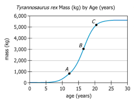
For integer values of age from 12 to 30, the average mass falls approximately between kilograms.
The percent change from age 12 to 16 is approximately the percent change from age 16 to 20.
3.3 Scatter Plots & Regression
Scenario: 40 points comparing Ocean vs Air Temperature. Data measured at noon on Wednesday of each of 40 consecutive weeks last year. Solid line is the regression line and the dashed line is the line through the points (0,0) and (6,6). We must analyze the relationship and the slope.
Temperature Scatter Plot
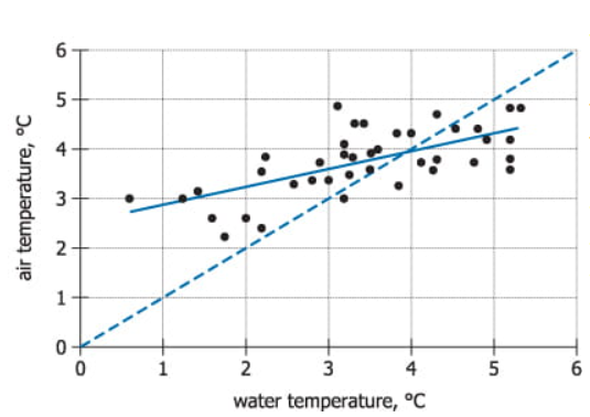
The relationship between water temperature and air temperature is .
The slope of the regression line is the slope of the dashed line.
Study Guide Completion
Mark this guide as completed once you've finished studying the strategy and takeaways.